Modern Window |
ModernWindow, represents Modern UI style Window object, which holds its contents in MVVM techniques.
 Concepts
The following diagram shows the basic conception structure of a Modern Window. Application Icon, Title bar and Control Box (including minimize, maximum and close) button are found in their traditional position.
Then followed by the Main menu and sub menus.
The main area is the content, which is defined in the ContentType property of selected ModernMenuItem.
At the bottom, the Status Bar. Where you can hold buttons and text to show the status.
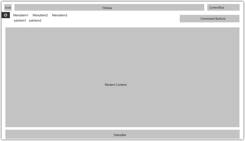 Main menu and sub menus
Hummingbird UI Framework supports a 3-level-menu system, The first level is shown on top, with larger font. The second level is under the first level with smaller font. And the 3rd level is shown on the left side of the Content Panel
To add items in the MainMenu, you should add elements of Type ModernMenuItem in ModernWindow.MainMenu property. The ModernMenuItem contains an Items that can present second or third level menu items
To create the link between the content and the ModernMenuItem, assign the Property ContentType
The following XAML code shows an example of a 3 level menu system:
<ui:ModernWindow.MainMenu>
    <ui:ModernMenuItem Header="menus" Key="menus" >
        <ui:ModernMenuItem Header="level2" Key="level2">
            <ui:ModernMenuItem Header="level 3 menu 1" Key="31" ContentType="{x:Type demo:ViewLevel3MenuDemo1}" />
            <ui:ModernMenuItem Header="level 3 menu 2" Key="32" ContentType="{x:Type demo:ViewLevel3MenuDemo2}"  />
            <ui:ModernMenuItem Header="level 3 menu 3" Key="33" />
        </ui:ModernMenuItem>
    </ui:ModernMenuItem>
    <ui:ModernMenuItem  Header="themes" Key="themes" ContentType="{x:Type demo:ViewThemes}" />
    <ui:ModernMenuItem  Header="advanced features" Key="advanced" />
</ui:ModernWindow.MainMenu>
If the Menu contains sub items, the ContentType should not be assigned.
 Note Note |
|---|
You must give a unique value to Key to each ModernMenuItem, that you can then use NavigateTo Method to switch between views via le code. |
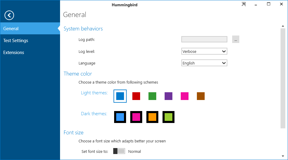
Backstage panelBackstagePanel is where you can put application configurations, settings or other global information. Inside the Backstage Panel, you should place a TabControl with one or more TabItem, as shown by the following XAML Code, each tab item is empty in the example.
<ui:ModernWindow.BackstagePanel>
    <TabControl>
        <TabItem Header="General"></TabItem>
        <TabItem Header="Settings"></TabItem>
        <TabItem Header="Extensions"></TabItem>
    </TabControl>
</ui:ModernWindow.BackstagePanel>
 Status Bar
In the ModernWindow, you can define a default status bar, which shows in the bottom of the window. This DefaultStatusBar is shown if the current ModernContent does not have a status bar.
When a StatusBar is defined in the ModernContent, this area will be replaced by the StatusBar defined in the ModernContent.
When switching from a ModernContent having a StatusBar to a ModernContent without StatusBar defined, The Default status bar will be shown.
The following example shows how to initialize a Status bar, and how it appears.
<ui:ModernWindow.DefaultStatusBar>
    <StatusBar>
        <ui:AppBarButton IconKey="appbar_new" Caption="new" />
        <ui:AppBarButton IconKey="appbar_folder_open" Caption="open" />
        <ui:AppBarButton IconKey="appbar_save" Caption="save" />
        <ui:AppBarButton IconKey="appbar_close" Caption="close" />
        <ui:AppBarButton IconKey="appbar_arrow_expand" Caption="expand" />
        <ui:AppBarButton IconKey="appbar_draw_brush" Caption="brush" />
    </StatusBar>
</ui:ModernWindow.DefaultStatusBar>
 See Also