Quick start guide |
This is a quick introduction article, lets you to create an empty but functional modern application in less than 10 minutes.
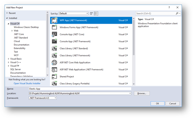
Using Visual Studio, you could get a free copy of Visual Studio Community, Create a new WPF App project, as shown

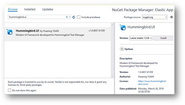
Right click on the project and choose Manage Nuget Packages
Search the package Hummingbird.UI and install it:

Now the packages and its dependencies has installed correctly.
Open App.xaml and insert the following code:
<Application.Resources>
    <ResourceDictionary>
        <ResourceDictionary.MergedDictionaries>
            <ResourceDictionary Source="pack://application:,,,/Hummingbird.UI;component/Styles/DefaultStyle.xaml" />
        </ResourceDictionary.MergedDictionaries>
    </ResourceDictionary>
</Application.Resources>
This resource will import Hummingbird UI Styles and ColorShemes in the application. The default theme is Blue / White, if you want to use other color schemes, you can add a Resource Dictionary. For example these codes in App.xaml will choose Purple / Black theme:
<Application.Resources>
    <ResourceDictionary>
        <ResourceDictionary.MergedDictionaries>
            <ResourceDictionary Source="pack://application:,,,/Hummingbird.UI;component/Styles/DefaultStyle.xaml" />
            <ResourceDictionary Source="pack://application:,,,/Hummingbird.UI;component/Styles/ColorShemes/Dark_Purple.xaml" />
        </ResourceDictionary.MergedDictionaries>
    </ResourceDictionary>
</Application.Resources>
Some build-in theme are available. Please refer to Article Themes for details.
In Hummingbird UI Framework, There are two types of Window: ModernWindow that is used for Modern UI Applications, BasicWindow is used to build traditional like windows.
ModernWindow is a MVVM container, holds different ModernContents. It is recommended to use ModernWindow as application's main window
While BasicWindow is the classic independent window. It is recommended to use BasicWindow as Dialogs or Popup Windows.
To define the main application user interface, you need to change the Window tag to ModernWindow and import the UI Framework namespace xmlns:ui="clr-namespace:Hummingbird.UI;assembly=Hummingbird.UI
<ui:ModernWindow
    xmlns:ui="clr-namespace:Hummingbird.UI;assembly=Hummingbird.UI" x:Class="Elastic_App.MainWindow"
        xmlns="http://schemas.microsoft.com/winfx/2006/xaml/presentation"
        xmlns:x="http://schemas.microsoft.com/winfx/2006/xaml"
        xmlns:d="http://schemas.microsoft.com/expression/blend/2008"
        xmlns:mc="http://schemas.openxmlformats.org/markup-compatibility/2006"
        xmlns:local="clr-namespace:Elastic_App"
        mc:Ignorable="d"
        Title="My Elastic App" Height="450" Width="800">
    <ui:ModernWindow.MainMenu>                                                    <!-- Defines the MainMenu of the application -->
        <ui:ModernMenuItem Header="search" Key="SEARCH">
            <ui:ModernMenuItem Header="BY JSON" Key="JSON" >
                <ui:ModernMenuItem Header="BUILD JSON REQUEST" Key="BUILD" />     <!-- MenuItem can contain sub items -->
                <ui:ModernMenuItem Header="RUN JSON REQUEST" Key="RUN" />
            </ui:ModernMenuItem>
            <ui:ModernMenuItem Header="BY COMMAND LINE" Key="COMMAND" />
            <ui:ModernMenuItem Header="BY CONTEXT ID" Key="ID" />
        </ui:ModernMenuItem>
        <ui:ModernMenuItem Header="configuration" />
        <ui:ModernMenuItem Header="help" />
    </ui:ModernWindow.MainMenu>
</ui:ModernWindow>
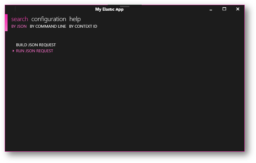
The above example created an application with 3 main menu items: Search, Configuration and Help. While the search menu contains also some sub items. In Hummingbird UI Framework, the Modern Window can hold maximum of 3 level menus. To each level, you can add sub items in the tag <ui:ModernMenuItem>
For each ModernMenuItem, you must provide Header - the text to display, and the Key - unique identifier of the menu item. You should also assign a ModernContent to the property ContentType in order to create the link between the Menu item and it's content. Hummingbird UI framework handles the instance of the content.
Congratulations, you can now build and see a Black backgrounded Window with Purple highlighted text (if Dark_Purple.xaml is applied in App.xaml).

So the content is empty. Please refer to next article for detailed information of ModernWindow